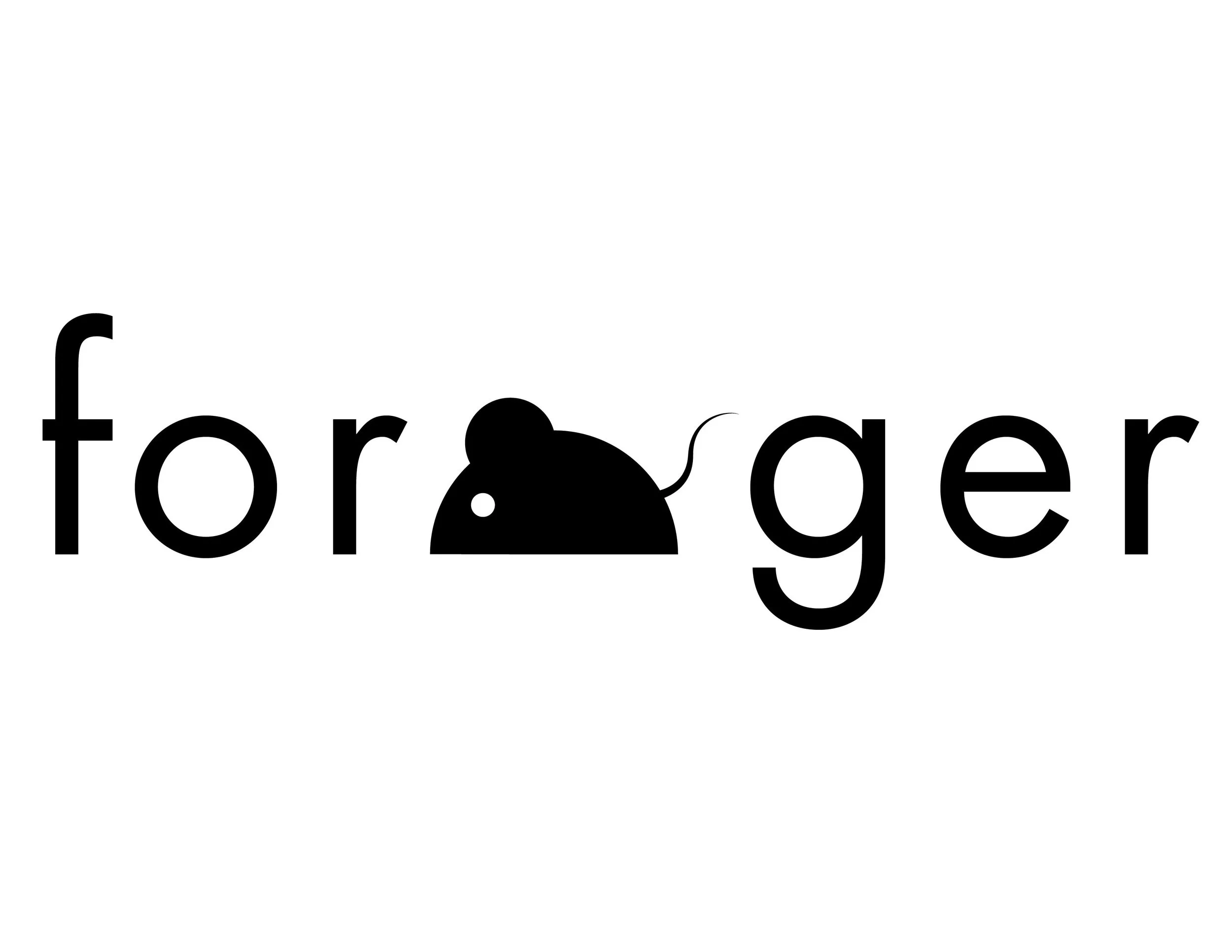
"Forage" was my final wordmark for my Typography 1 class. We started this project by listing out animal attributes. The most typographically interesting word I came up with for the mouse was "forager", which I shortened to "forage" for this project.
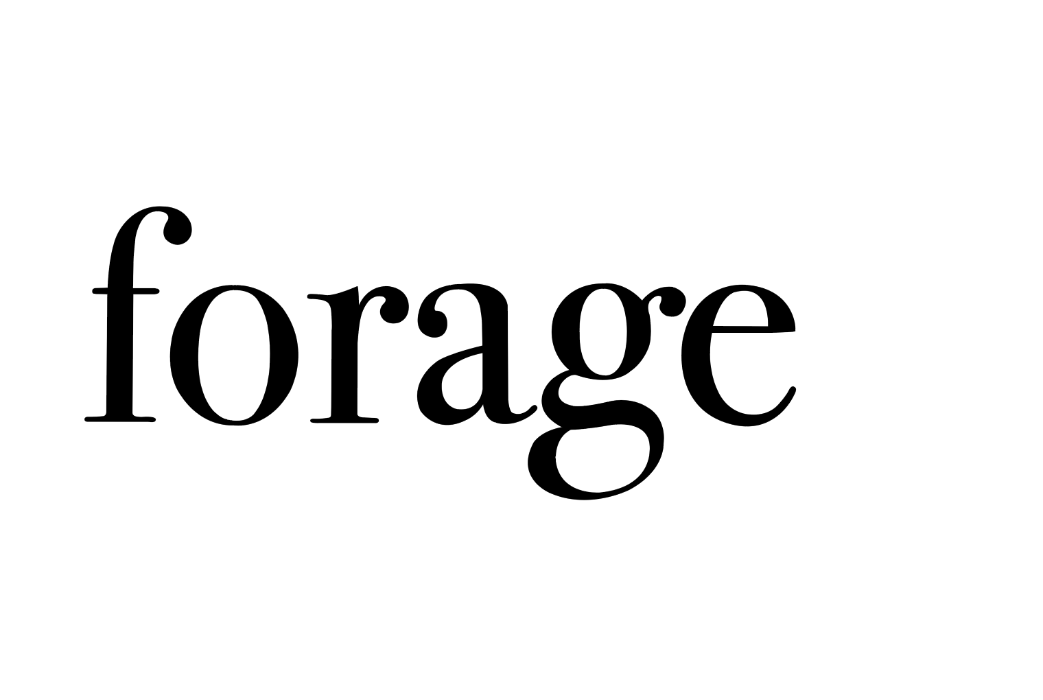
After time spent understanding this word wholly in various typefaces and situations, I began experimenting with graphical abstractions that would represent the visual semantics of the word forage. I eventually settled on replacing the "a" in forage with the simple mouse form I created. I made many variations of the mouse form, the final one being the most legible within the word.
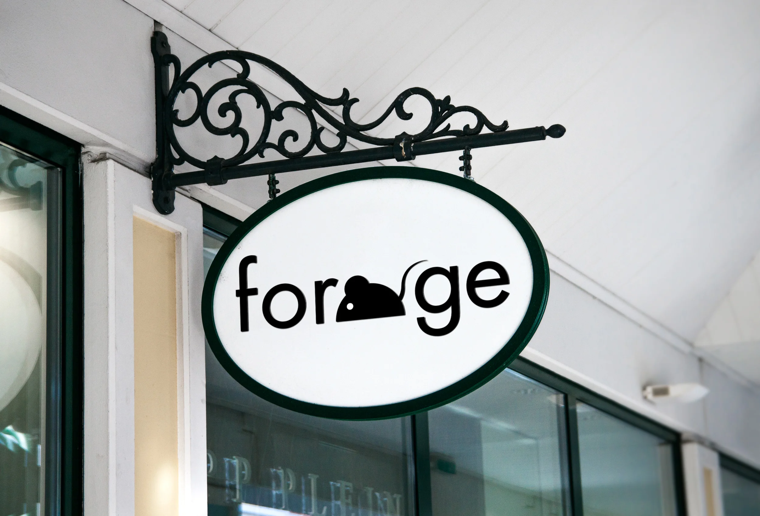
The practical application of my wordmark is a logo for a thrift store, specializing in clothing used between 1980-2000.
The final wordmark.
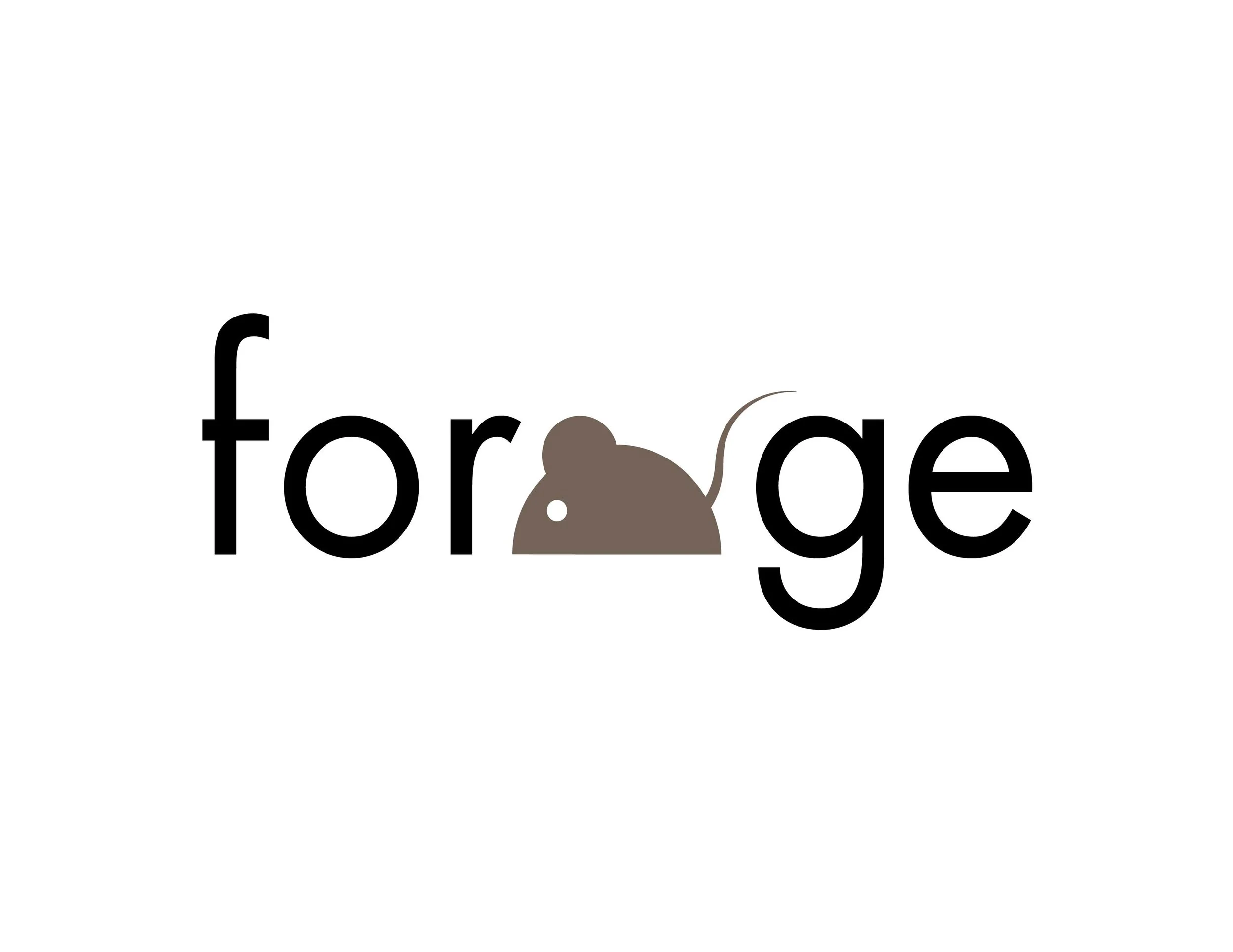


Various experimentations I did with and without the mouse form. I decided not to use color in my final.

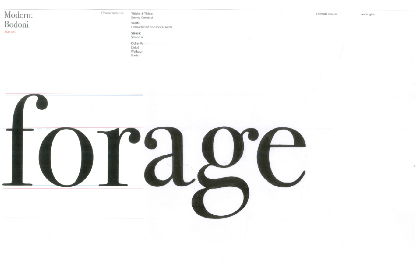
In an attempt to better understand our words, we traced the word on paper with pencils and ink pens, then we scanned them into the computer and corrected our mistakes using vector drawings so they looked exactly like the typeface.